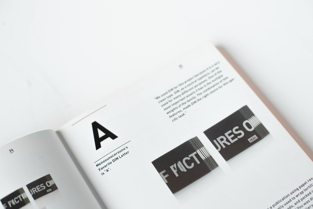
When creating a brand identity, typography is a fundamental element that conveys the personality and message of the business. Logo design software plays a crucial role in styling and customizing typography, especially in adjusting letter spacing (also referred to as tracking or kerning). These tools provide designers with intuitive and powerful controls to manipulate type, ensuring balance, aesthetic appeal, and legibility within logos.
Understanding Typography in Logo Design Software
Typography involves the selection and arrangement of type to make written language legible and appealing when displayed. In the context of logo design software, such as Adobe Illustrator, CorelDRAW, and online platforms like Canva or Looka, this becomes more nuanced. Designers can experiment with typefaces, scale, alignment, and spacing to achieve a visual hierarchy and brand tone.
Most logo design tools integrate extensive font libraries, including both system fonts and custom options available through cloud-based font services like Google Fonts or Adobe Fonts. The software typically categorizes fonts based on type (sans-serif, serif, script, display), helping designers choose the best option aligned with brand personality.
The software also provides real-time visualization, allowing designers to see how different fonts interact with graphic elements, colors, and layout. This visualization plays a vital role in ensuring cohesion and branding consistency.

How Letter Spacing is Handled
Letter spacing, or tracking, is the adjustment of the space between characters in a word or phrase. Good letter spacing balances legibility and visual harmony, which is why logo design software offers precise control over this aspect.
There are commonly two types of letter spacing adjustments:
- Tracking: Applies uniform spacing between all letters in selected text.
- Kerning: Adjusts the space between specific character pairs to optimize visual balance.
Logo design software typically integrates sliders, number fields, or click-and-drag interfaces to allow precise control over both tracking and kerning. Often, these tools display real-time measurements of spacing in units such as points or pixels.
Automatic vs. Manual Adjustments
Modern software leverages AI-driven typographic engines that provide automatic spacing suggestions. These algorithms analyze character shapes and relationships to suggest ideal spacing values. However, designers may choose to override these settings to match brand aesthetics or to create custom typography effects.
Manual adjustments are especially common in high-end or professional logo software. Using vector paths and anchor points, designers can manipulate each character individually, even transforming text into editable vector shapes for extreme customization.

Integration with Other Design Elements
An essential feature of professional logo design software is the ability to seamlessly integrate typography with other design components. Designers can:
- Align text to shapes, paths, or guides
- Apply transformation effects like rotation, distortion, or warping
- Use blend modes and masking to harmonize typography with background elements
These capabilities offer creative freedom, allowing brands to stand out with distinctive typographic styles that are memorable and visually compelling.
Export Options and Compatibility
Once the typography is finalized, logo design software offers multiple export formats that preserve typographic quality. These include vector formats like SVG, EPS, and PDF, ensuring scalability without quality loss. Some platforms also offer raster formats (PNG, JPEG) with embedded font outlines or converted paths to secure type appearance across devices.
For collaborative projects, software platforms support file-sharing options and cloud-based syncing, ensuring that all team members view consistent typography settings, even when switching between devices or operating systems.
Frequently Asked Questions (FAQ)
-
Q: What is the difference between tracking and kerning?
A: Tracking adjusts spacing evenly across all characters, while kerning focuses on correcting spacing between specific letter pairs. -
Q: Can I import custom fonts into logo design software?
A: Yes, most programs allow users to install and use custom fonts compatible with their operating systems. -
Q: Why does letter spacing matter in a logo?
A: Proper letter spacing ensures legibility, aesthetic balance, and communicates professionalism within the brand identity. -
Q: Do free design tools offer typography control?
A: Some free tools like Canva and Figma offer basic spacing adjustments, though premium versions provide more detailed controls. -
Q: Is converting text to outlines necessary?
A: Yes, to preserve font appearance when sharing or printing, converting text to outlines ensures no font substitution occurs across systems.

