Logos are central to a brand’s identity, but even the most well-designed logo can fall short if spacing issues make it appear cramped or unbalanced. In web and graphic design, the devil is frequently in the details—and spacing is one of the most overlooked yet crucial components of quality composition. Crowded logos can disrupt visual hierarchy, create pressure points in a layout, and cause brand impressions to suffer. Fortunately, by making thoughtful adjustments to padding and margin, designers can radically improve the presentation without altering the logo itself.
TLDR
When logos looked crowded on websites or digital applications, it was often due to inadequate margin or padding, not the logo design itself. Adjusting the space around logos using CSS or design tools significantly improves legibility and visual harmony. By expanding padding and applying consistent margin rules, designers achieved a balanced layout that enhanced the user experience. Proper spacing transforms how content is perceived—making visuals cleaner, more professional, and easier to navigate.
Understanding the Crowded Logo Problem
Initially, many designers run into issues when placing a logo in a header or promotional area. Often, the problem isn’t the logo’s quality or color—it’s how tightly it sits next to other design elements. Without breathing room, even the most elegant design can seem claustrophobic or tension-filled. Some typical signs of a crowded logo include:
- The logo appears too close to navigation links or icons.
- Text beside the logo looks compressed or misaligned.
- The overall header feels heavy or imbalanced.
- The layout lacks whitespace for the eye to rest.
This issue typically originates either from default browser styles or from overlaying page structures in CSS that haven’t accounted for spacing subtleties.

Diagnosing the Layout with Developer Tools
Before jumping into a redesign, the first step is diagnosis. Using browser developer tools such as Chrome DevTools allows designers to inspect the logo element’s box model. They can review the padding, margin, and border currently applied to the logo and its surrounding containers.
Things to look for during inspection include:
- Zero or minimal padding on the container div enclosing the logo.
- Negative margins accidentally applied to push elements closer.
- Conflicting CSS rules inherited from external stylesheets causing cramped spacing.
This step identifies the exact culprit, whether it’s a missing style rule or an accidental compression due to constraints on parent containers.
The Role of Padding vs. Margin
Before diving into solutions, it’s important to understand the difference between padding and margin—a topic frequently misunderstood, especially by junior designers.
- Padding: The space inside an element’s border. It creates internal buffer space around the content. For a logo, this would be the space between the logo image and the edge of the container that holds it.
- Margin: The space outside the border of an element. In the case of a logo, this determines how far it sits from other boxes, text, or images placed nearby.
Using padding and margin together helps create an elegantly spaced layout that not only centers the user’s attention on the brand but also integrates harmoniously with UI/UX components.
Applying Real-World Adjustments
Once diagnosis is complete, balancing the layout involves testing incremental changes. For example, if the logo is pressed up against a navigation menu, a simple margin adjustment might suffice:
header .logo {
  margin-right: 20px;
}
Or suppose the logo itself feels “boxed in” within its boundary. Applying padding can free it up inside its visual container:
.logo-container {
  padding: 15px 20px;
}
Changes like these affect visual clarity in subtle but impactful ways. It’s especially important to use consistent spacing rules across screen sizes and test how the layout adjusts responsively.

Responsive Design and Mobile Considerations
Correct spacing doesn’t end with desktop layouts. In fact, mobile views often exacerbate spacing problems due to limited real estate. Logos that look fine on wide screens may suddenly dominate or cramp interfaces on smaller devices. Responsive padding and margin rules must be added via media queries to address this:
@media (max-width: 768px) {
  .logo {
    margin-right: 10px;
    padding: 10px;
  }
}
This ensures that no matter the screen size, the logo is granted the space it needs without overwhelming nearby visuals or becoming invisibly squeezed.
Working with Grid and Flexbox Layouts
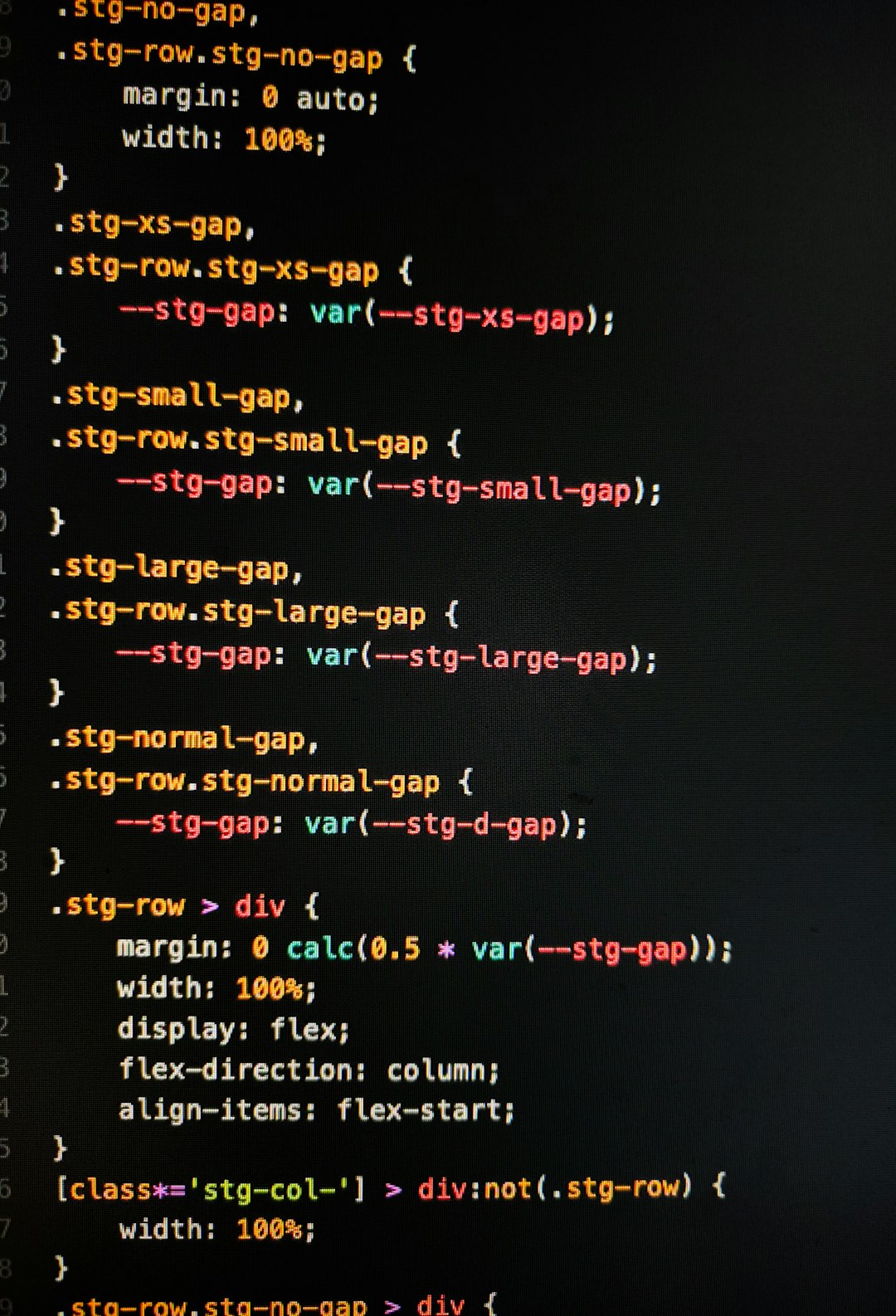
Modern layouts relying on CSS Grid or Flexbox open up new ways of enforcing spacing consistency. With Flexbox, aligning and spacing logos becomes incredibly intuitive using properties like justify-content and gap.
.header {
  display: flex;
  align-items: center;
  justify-content: space-between;
  gap: 30px;
}
This method not only adds spacing but also aligns all elements cleanly and responsively. Grid-based layouts enable even more fine-tuned alignment and customized flow, offering pixel-perfect precision across breakpoints.
Visual Hierarchy and Branding Impact
Why all this attention to just a few pixels of space? Because visual hierarchy makes or breaks a brand’s digital presence. A clean, well-spaced logo helps anchor the page, signals professionalism, and directs the user naturally through the layout. Small improvements in margin and padding often carry the heaviest visual ROI.

Final Thoughts
Fixing spacing around a logo may seem minor, but it is vital to both usability and design quality. Designers who take the time to balance padding and margins create cleaner layouts and elevate the brand’s perceived value. Whether adjusting CSS styles, utilizing Flexbox, or handling breakpoints in responsive design, the payoff from correctly spacing a logo is substantial.
In the world of UI/UX and brand presentation, spacing isn’t an afterthought—it’s part of the message.
Frequently Asked Questions (FAQ)
-
Q: What’s the main difference between padding and margin?
A: Padding is the space inside an element, while margin is the space outside the element, separating it from others. -
Q: How much margin should I add around my logo?
A: It depends on your overall design, but common practice is between 10px–30px, adjusted for screen size. -
Q: Can excessive use of margin or padding harm a layout?
A: Yes. Overuse can create disjointed spacing and responsiveness issues, especially on smaller screens. -
Q: Is Flexbox better than using margins for layout spacing?
A: Flexbox offers cleaner, more consistent spacing and alignment control, especially in responsive designs. -
Q: Should logos be centered or left-aligned?
A: There’s no universal rule; it depends on your layout’s hierarchy and content flow. Both can work with proper spacing.


